FINAL PROJECT PROPOSAL
RESEARCH
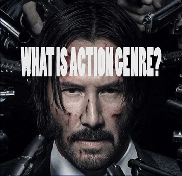
WHAT IS ACTION GENRE?
Action Genre is a humongous genre beyond the globe, im sure everyone who knows what a movie is would be able to name you a big thriller. The genre is known for having tremendous impact, continuous high energy, lots of physical stunts and plenty of activity. Also known for chases scenes, races, really close call rescues, big battles, many of martial arts. The genres biggest names are James Bond, Black Panther ( newer one from 2018), The Avengers and iron man. Main action movies base there main character off of a male action hero or protagonist. But as off lately a lot more women have fit into main roles in action movies such as Captain Marvel, Superwomen and Wonder women, All of these being Heroins. These heroes or heroins are thrust into a series of challenges that typically include a lot of violence, extended fighting and generally fighting against incredible odds against the villain, monster or anything that is attempting to stop the hero or heroin getting to the goal there heading for. The early action genre was actually built from "The Great Train Robbery" made in 1903 and were mainly known for stunt films as it was men jumping around attempting to escape certain areas or fight with certain other characters. The 20th century the action films flourished from mid range budgeting to a huge jump as now some movies are being given. Avatar which was made in 2009 had a budget of exactly $478,792,608 this is close to half a billion dollars which was spent on a movie and then the worldwide gross return managed to rake in $3,136,279,608.
MOVIE SCENES USED FOR POSTERS
|
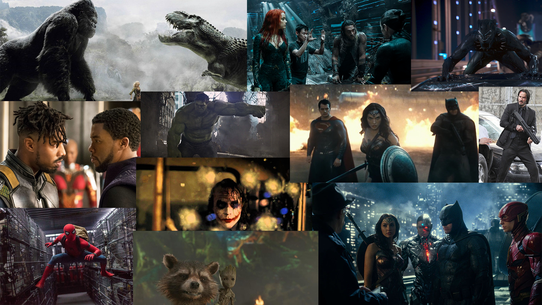
In these scenes they all look like build ups to fight scenes and are freeze frames. Such as the bottom left of Spider Man he is stretched over what looks like cages of what could be animals but this scene could easily be made into a banner or poster as you could add a simple text of the spider man poster text and add it. The middle right with John Wick could also be made into a poster as it is a scene of John Wick walking past vehicles with a weapon in arm. He is wearing a all black suit which makes it look better and more professional. The top right picture of Black Panther on top of a car is also a scene of him looking as though he is either in a intense action moment or very soon about to.
|
MISC EN SCENE IN ACTION MOVIES
|
This is a huge action scene that lasts 8 minutes long. It has many different angles used from Close ups on Will Smith, Will Ferrel and Steve Carrel. There is a lot of action and brutal yet PG action in this comedy film. I would personally say that Comedy films are either Action Films with a little or Comedy or Comedy films. There really isn't a mix but the anchorman 2 was a perfect movie that proved the above statement wrong. In this scene it has quite a long build up which is perfect for the action genre as it adds suspense and you start to picture in your head what might happen? The Different angles in the scene is also very well angled and generally filmed as the Mid shots are in many different angles breaking the 180 degree rule in many different ways but makes perfect sense at the same time. Such as when the other crowd comes to the park as then there are 3 different focuses for the camera meaning it would be difficult to keep the rule.
|
This is the final battle scene from Transformers 5 it uses many different angles from very close ups on Optimus Primes face and also goes to the human characters such as the military and shows mid range shots of them jumping off a cliff, This final scene has many intense shots where it has optimus prime and a transformer dinosaur battling it out in an extreme long shot. It then changes shots completely and has a shot of a high in command army employee at the army base talking to one of the soldiers who are in action sharing clutch information.
This video here is a TV series and is very popular around the world. On the left side is the URL on the office its a scene from when they are interviewing for a new regional manager. The scene consists of the same shot throughout the long durated mini clip. Its staying in the same close up shot of every different "interview" as it shows the viewer that they are all there for the interview. It has a different shot when it goes to Jenna Fischer(Pam) where the show also know that she is the receptionist and that she works at Bob France Refrigeration(Dundler Mifflin).
|
IDEAS
Villain poster with the Main villain and secondary Villain if there is one and enough resources.
Villain poster with the Main villain and secondary Villain if there is one and enough resources.
MIND MAP
|
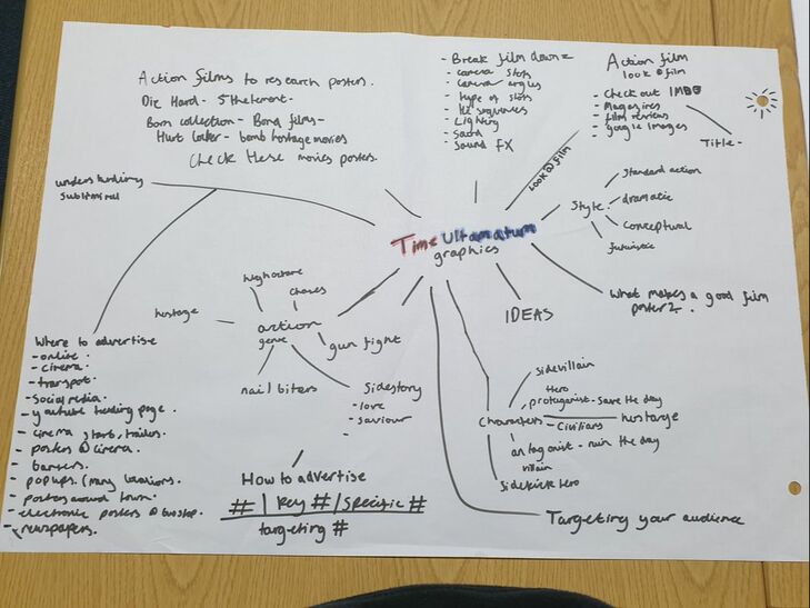
This is my mind map and i made this in a small group of individuals. The ideas here show what style i want my work to be like and it has a couple options such as Dramatic, Futuristic or Standard Action. It has questions for myself to google later such as "What makes a good film poster?". It has a list of the characters in a film such as Hero, Civilians, Villains, Sidekicks and SideVillians. It also has the advertisement ideas and how to reach more people such as many different "#". Key # such as what links to movies, Specific # which link to certain characters and general hashtags that link with the movie, targeting # is for the audience of a movie.
|
DAILY BLOGS
12th March: This was my introduction to my Time Ultimatum. I started my Final Project Proposal. We started our Project proposal and it took a lot of research and thought to first of decide what topic i was going to do for the TU.But once i decided Graphics many ideas started to flow and I thought that graphics would be perfect. I finished this day with a little amount of text left needed for my Final Project Proposal.
14th March: In the morning I finished up the Final Project Proposal. The rest of the day i wrote about what is a Action Genre, This took a while to write and finished at around lunch. I came back and then proceeded a little with the text about the Action Genre. And then started research about Action Films and made a separate page for Inspiration for ideas I could use for my Posters
15th March: I was Ill and didn't come in. But did work on my Weebly a little at home and did the graphics for my pages at the top by using random scenes in Action movies and then wrote what the page was over in a text with the opacity slightly turned down so you could make out what was behind the text and used more interesting text as it catches the eye.
19th March: In the morning we made Mind maps in a small group of four. After this I worked on the layout on my Weebly and added to my Blog and added text which helped describe what my Mind Map is about and why I wrote what I wrote.
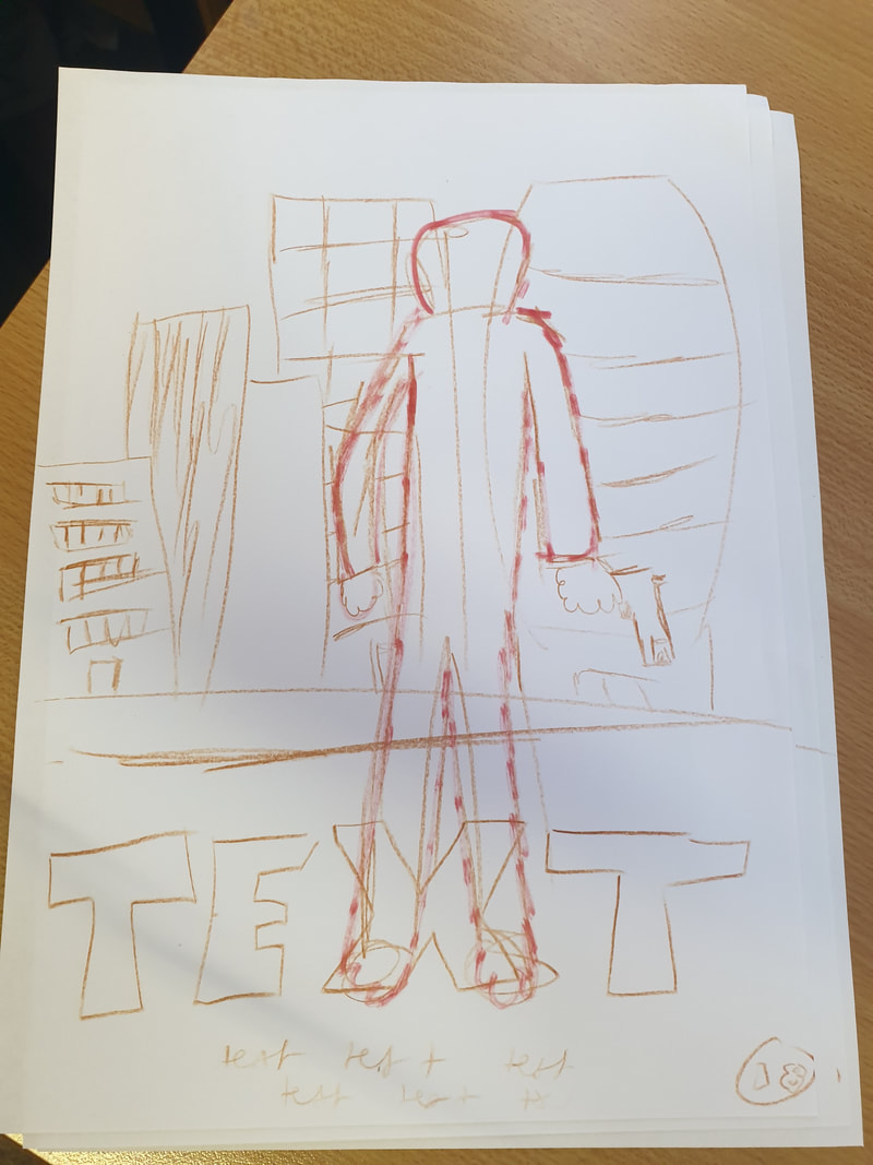
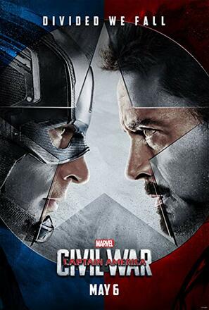
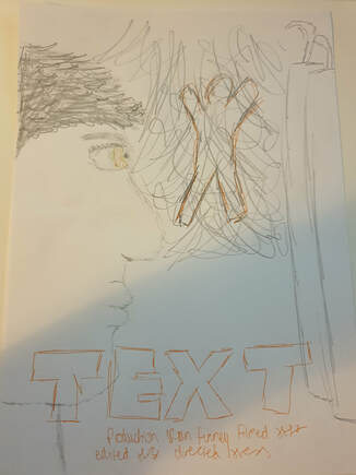
20th March: This is my day off and I decided to fix up my Weebly page and add and take away certain features from the website. I first searched up some action posters on Google so i could see what would inspire me and i decided on the civil war poster. And copied how the faces looked at each other. I sketched it up and then saved it to my google drive and uploaded it to Weebly and then I wrote about the differences and why I sketched up that idea and finally I sketched up a idea for a banner idea and then added it to the the Weebly site and compared it to the scene I got the idea from and wrote about how I changed it up and what I did to make it a unique idea.
21st March: In the morning I added to my Weebly site with "MOVIE SCENES USED FOR POSTERS" with this i took some popular films and used there scenes with certain individuals and wrote how they can simply and efficiently be made into posters. On this day I had parents evening so I stayed until late as there wasn't much point in me going home. I decided to spend the rest of my day to go into characters and how they would effect the posters. I wrote about the main character which is the Hero, The second main character who is the Villain and wrote about the double headed character posters, These posters if you scroll down you will instantly know these posters as they are very effective and clean posters that look good.
28th March: In the morning I wrote about how movie posters are made and in this I generally wrote about what posters have on them as there is a big difference ranging from the genres. I then googled posters and put them into a Photoshop document and put them all in a wide document where you can see the all of the different varieties. After I added the image of all the posters into weebly I continued to write about the posters and what makes them fit into there genre and how other posters in that genre can be seen as very similar. I then continued to do research on the technical creation of movie poster and did a personal list on how I would perfectly attempt to make my Posters. i then went on to add examples off the backgrounds, typography, logos and Focal points.
29th March: In the morning I found certain texts that I would like to use for the posters and selected bold and modern texts and several fonts that would fit perfect for my poster which is familiar to bombs and all link together. I then decided to work on a Poster that I had thought of before just to get a slight idea on what I would be working on, I did it about my favourite rapper J.Cole.
2nd April: In the morning I found some more texts that would look good with the poster and I also searched up and found my name which is "Maximum Action". I got this name off of a random name generator and from this it took me one minute and it immediately clicked that I liked the name and i thought that it just looked good.I then decided to make it into a 3D text and I immediately liked it.
4th April: In the morning we spoke about extremism and this took up almost the first hour, For the rest of the day I worked on a poster and decided to make it a Kobe Bryant inspired poster. This took most of the day up and i feel as though this wasn't a very productive day.
5th April: In the morning I wrote up about my Kobe Bryant poster and why and how I made it. This took up the first part of the day. I also must note that on Fridays I don't have English and I don't take maths.
23rd April: In the morning I added to the Kobe Bryant poster. I then went on to write about colour theory and colour psychology, with this it is just simply showing that I know how much colour can effect the poster and how crucial it is as it can make the movie much more hyped up.
24th April: Today I worked on my first poster and I added the bottom texts, Main text, logos at the bottom which specified the age, and The actors text.
30th April: Today I worked on my secondary poster and did this for most of the day obviously and I also helped out my friend with his movie and this also took up 1/4 part of the day. I came home after I my dentist appointment and worked on my main character poster and finished it, After I finished my main character I decided to work on my main poster and worked most of the way up to near the end.
2nd May: In the morning I started on my second poster. We took photo's of my colleague Ryan Hodge and we took over 100 photos to make sure we got a good shot and I decided to use one for the main character poster as I had already done my main poster and had an idea for my second character poster.
3rd May: In the morning I started editing the main character poster and finished it off in the same day. I had trouble converting it into weebly as originally the size was to big but quickly fixed that by making the poster smaller.
5th May: this was a Sunday and I feel as though I am behind so I uploaded my 2nd character poster and started on my main poster. and caught up on my daily blog.
7th May: Tuesday morning I went through my website and added more text to the important areas such as my two completed character poster and compared the images to how I edited them to make the colours stand out more. I finally added some text and images to my practice and presentation.
8th May: Wednesday afternoon I started my evaluation and finished my final poster and uploaded it to weebly.
9th May: Thursday I went through my weebly page and started making my first banner in Photoshop.
14th May: Tuesday I took more photos of Ryan but a different angle as this was for my Banner. And I started and finished my first banner, I then wrote about this in the weebly page.
16th May: This Thursday I spoke to Stuart Hill, my tutor about my Weebly and saw if it was up to date and it was, For the rest of the day I worked on my evaluation and for the last hour I helped my friend who was behind out as I felt that was necessary.
17th May: This Friday it was the final day to finish up my project and I started and finished the website takeover graphic.
Formative Feedback - 19/03/2019 - Stuart Hill
Dan you really need to push forward with the following elements that I have identified below.
- Layout the website using the headings identified in the grading criteria COMPLETED
- More in-depth research is required using Mise en scene to break down posters that you have looked into, Films you have looked into COMPLETED
- A lot more annotation is needed across your website COMPLETED
- More in-depth information is required for your Daily / Weekly Blog, use the Who, what, where and when to help COMPLETED
- Storyboard of Ideas to help with your idealisation (poster etc) COMPLETED
- Look at the Time Ultimatum Prezi for what is required for the different elements
- All research to be uploaded and to be easy to find - with detailed annotation
- In-depth mood board to be created with annotation
Dan you really need to make a big push to work on all the relevant part required to complete Time Ultimatum.
SKETCHES, COMPARISONS AND DESCRIPTIONS
POSTER DESIGN
|
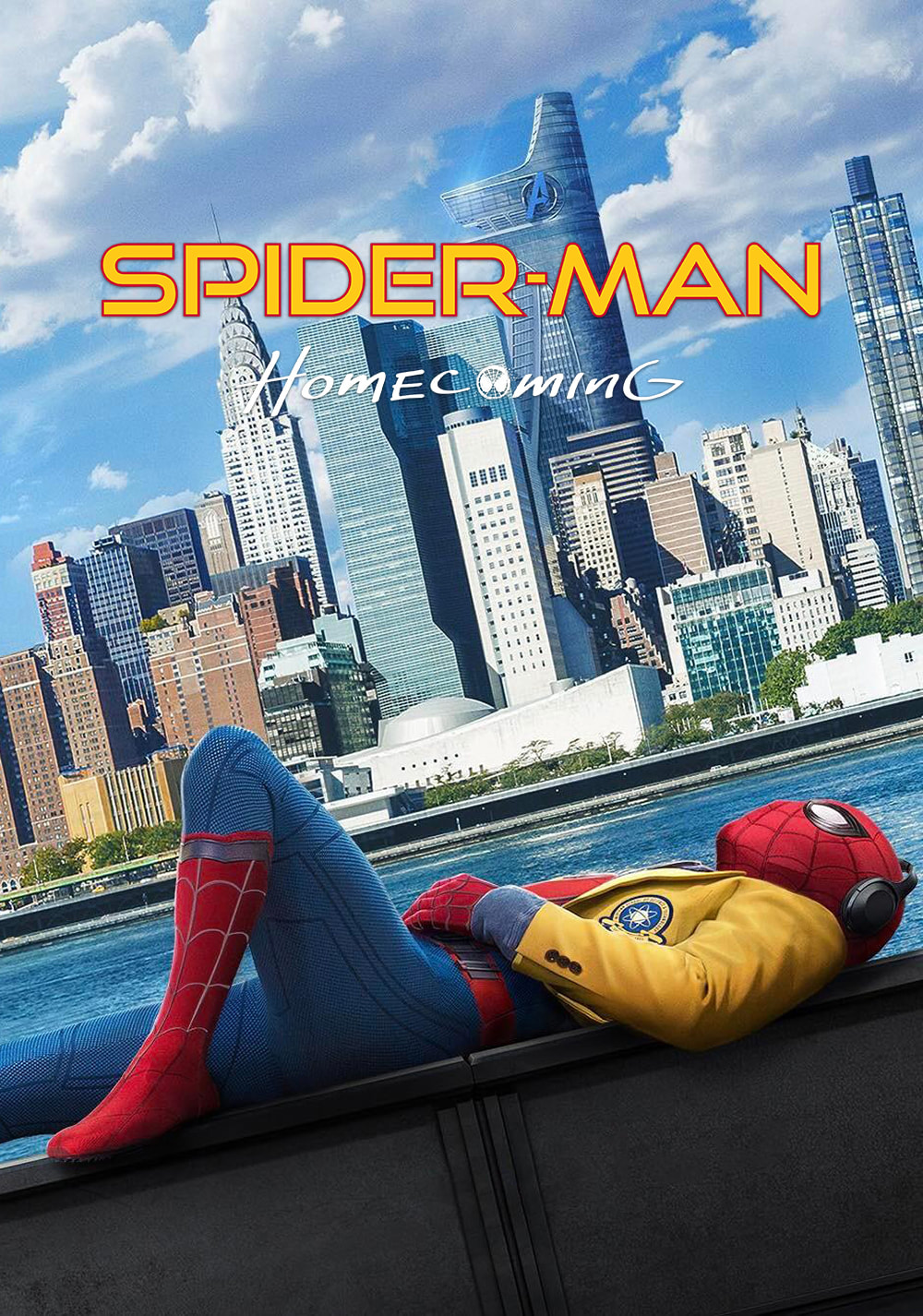
In these two Posters they both have skylines and i want to attempt and remake the Spider Man poster man but of course a different skyscraper, name, Character and spice it up such as having a normal skyline but with damaged skyscrapers such as broken glass, fire and smoke coming from the buildings. This could imply that a bomb has gone off and I have several ideas for my title such as "NO DEFUSER" and "BLOWN BOMB" as this can suggest that a bomb has gone off and that it wasn't able to be defused as with "NO DEFUSER" and with "BLOWN BOMB" it can imply that a bomb has blown up and from that it could show why the skyscrapers are destroyed and on fire.
|
|
POSTER DESIGN
|
This is the other poster I quickly sketched up and as you can see I copied the sketch from the left as the faces are looking at each other, I feel this alone is a great simple look as it looks dramatic and foreshadows that they're could be a battle between the two but instead of two characters I decided to switch the left with if you could tell explosive C4's and this of course is because the mini film is about a bomb scare and the characters main objective is to defuse the bomb and i also added in the middle a explosion and a figure which is the same character as the left. The explosion is meant to foreshadow that there is an explosion and this could mean that the bomb couldn't get defused in time.
|
|
BANNER DESIGN
|
From this Design I copied a scene from one of my favorite film series, The Hangover. The scene where "Lesley Chow" jumps off the top of Ceasers Palace in Las Vegas as he has to escape from "Alan" and "Phil" who were attempting to kidnap him. I put the character on top of a railing which from this could be the top of college building. And have it look as though hes falling from the building to death or to a safer place. The text of course is where the Movies title would be. And the background of orange flairs are meant to be flames which could also foreshadow that there is bomb that went off.
|
|
ADVERTISEMENT
CLOTHING ADVERTISEMENT IDEAS
These below are ideas for apparel which can be used for Advertisement. These 2 pieces of clothing i feel would go down perfectly with a certain crowd named "Hype beasts" these are person who follows a trend to be cool or in style. A person who wears what is hyped up.
These below are ideas for apparel which can be used for Advertisement. These 2 pieces of clothing i feel would go down perfectly with a certain crowd named "Hype beasts" these are person who follows a trend to be cool or in style. A person who wears what is hyped up.
|
|
PUBLIC ADVERTISEMENT
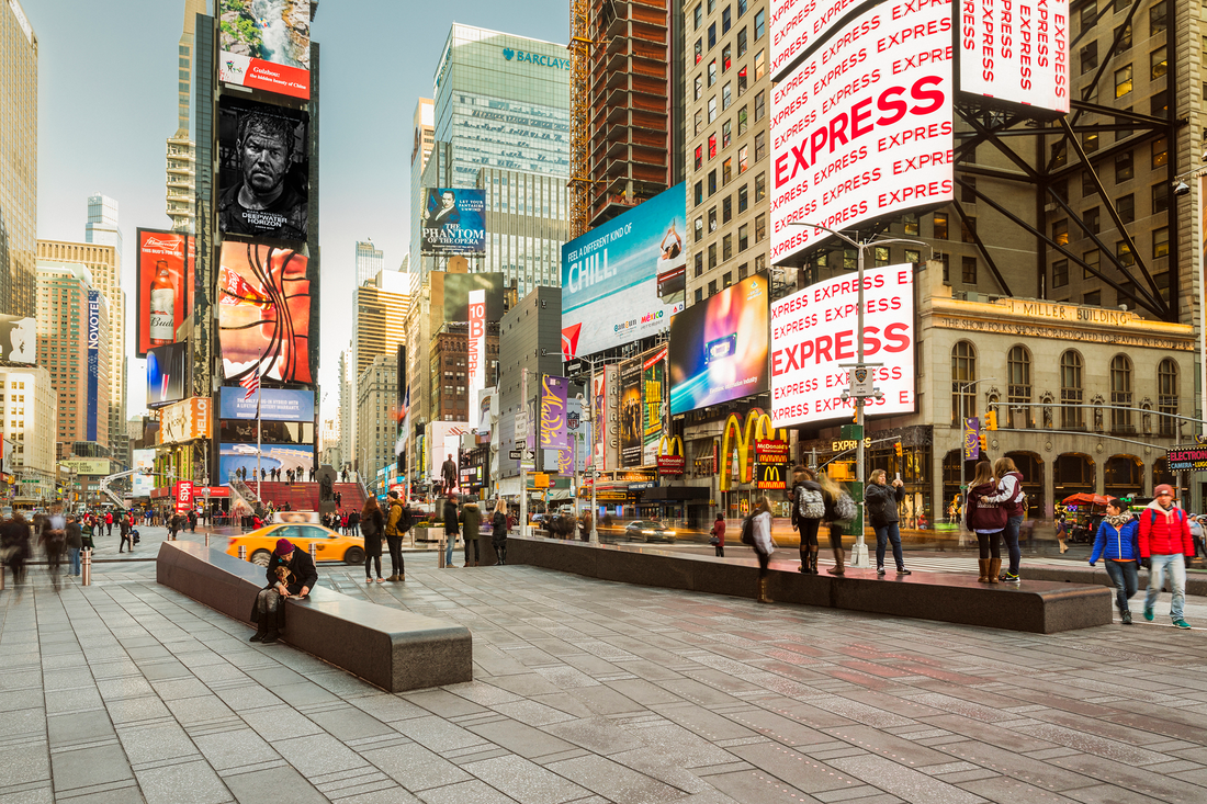
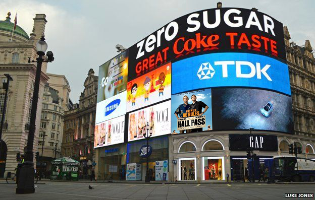
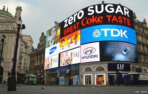
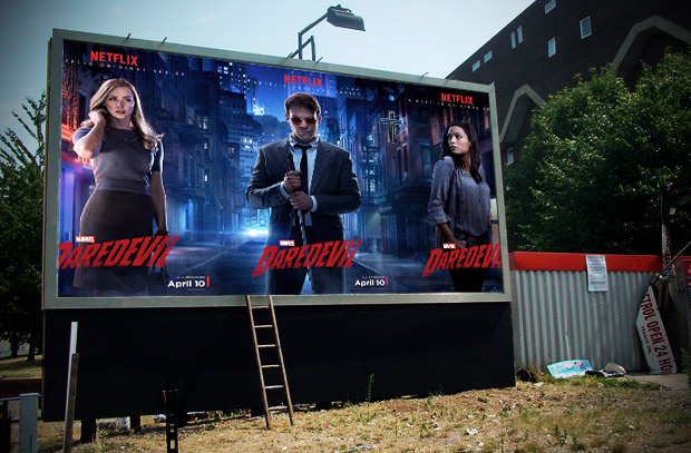
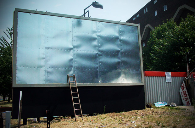
we can use public transports as advertisement and many different people would see it and depending on who saw it they could maybe go search for the movie as that is how a lot of sightings are. I remember seeing football on a sign before knowing there was a football team. That was an example of just how you can find out about things that don't exist and them certain things could be things you love in the future.The bottom left photo is a edited photo of Time Square and the right one is a non edited image. In the bottom right its a simple shot of Times Square and is day time, But in the bottom left one i have edited by adding a Mark Walhberg poster onto where the simple grey poster with white text had been, By myself editing this and describing the differences I am addressing I know what advertisement is and where you could find it but also knowing how expensive it would be to have a poster put up in times square.
we can use public transports as advertisement and many different people would see it and depending on who saw it they could maybe go search for the movie as that is how a lot of sightings are. I remember seeing football on a sign before knowing there was a football team. That was an example of just how you can find out about things that don't exist and them certain things could be things you love in the future.The bottom left photo is a edited photo of Time Square and the right one is a non edited image. In the bottom right its a simple shot of Times Square and is day time, But in the bottom left one i have edited by adding a Mark Walhberg poster onto where the simple grey poster with white text had been, By myself editing this and describing the differences I am addressing I know what advertisement is and where you could find it but also knowing how expensive it would be to have a poster put up in times square.
|

|
In this I switched out a random ad with a Mark Wahlberg movie poster.
|
|
In this I switched out the Hyundai ad with a movie poster of Hall Pass.
ADVERTISEMENT IN A RURAL AREA
These two images are in a rural area where there is a much less density in population and most of the time it will be about main advertisement that needs to be shown and many of the time it will be advertisement of the local companies and shows going on such as football because the big movies are advertised online so they wouldn't need to advertise in rural areas as also a lot of older civilians.
These two images are in a rural area where there is a much less density in population and most of the time it will be about main advertisement that needs to be shown and many of the time it will be advertisement of the local companies and shows going on such as football because the big movies are advertised online so they wouldn't need to advertise in rural areas as also a lot of older civilians.
|
|
HOW MOVIE POSTERS ARE MADE?
Movie posters are made through two main different programmes Photoshop and InDesign, InDesign being where they add the typography with more quality than Photoshop would do. The Designer will find out which genre is the movie and from that their can be a huge difference in what could be on the poster such as comedies are more likely have a bright poster with the characters as a preview to show you who might be the main character, Horror movies are mostly going to have a darker poster with either a item that can be seen as a weapon, item that can be used to scare or hurt people but can also show characters, Most romance posters have a repeated trend of the two characters who have the romantic path in the film either engaging with each other that being a kiss, hug or generally holding one another and Super Hero movie posters are known to have the characters in there outfit where they look as though they are about to engage into a battle scene or stood actively.
Movie posters are made through two main different programmes Photoshop and InDesign, InDesign being where they add the typography with more quality than Photoshop would do. The Designer will find out which genre is the movie and from that their can be a huge difference in what could be on the poster such as comedies are more likely have a bright poster with the characters as a preview to show you who might be the main character, Horror movies are mostly going to have a darker poster with either a item that can be seen as a weapon, item that can be used to scare or hurt people but can also show characters, Most romance posters have a repeated trend of the two characters who have the romantic path in the film either engaging with each other that being a kiss, hug or generally holding one another and Super Hero movie posters are known to have the characters in there outfit where they look as though they are about to engage into a battle scene or stood actively.
BANNER RESEARCH AND INSPIRATION
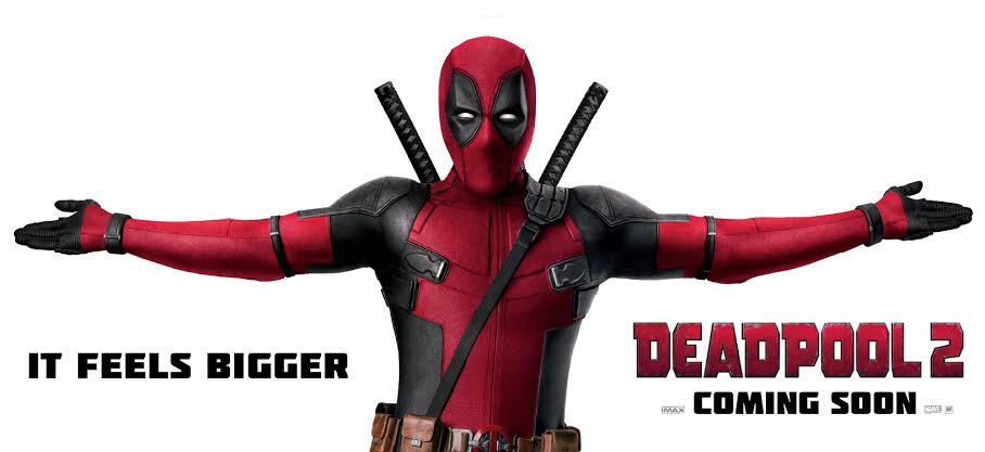
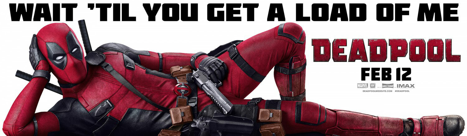
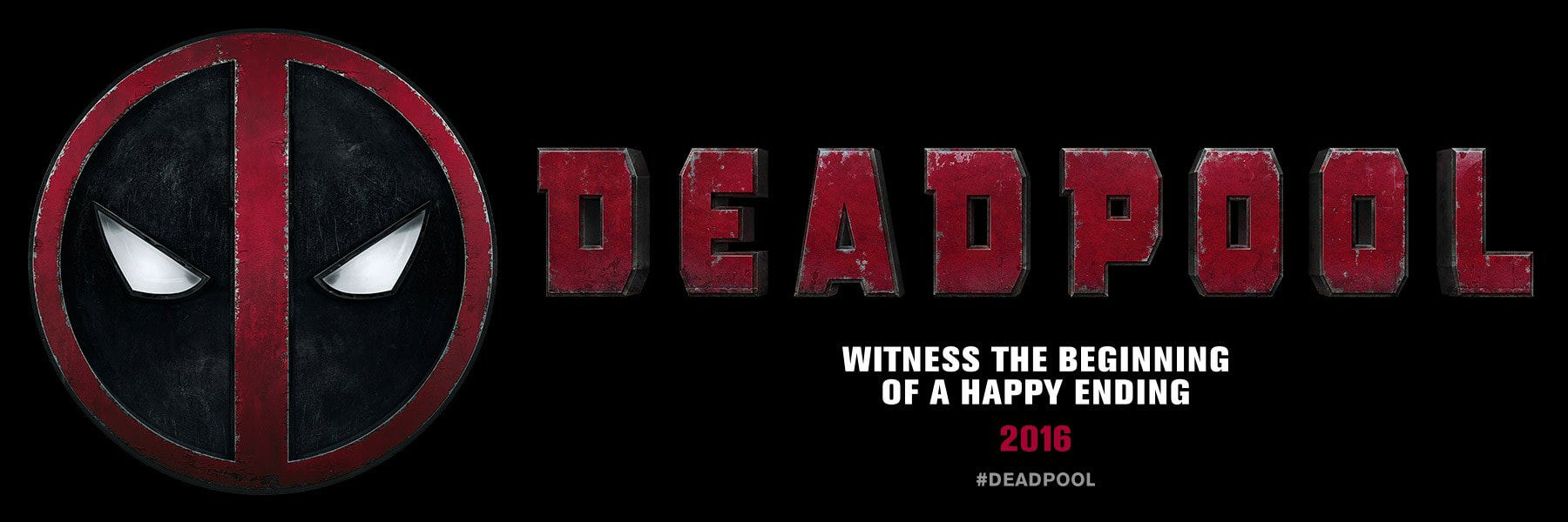
These 3 banners of Deadpool are really clean and simple and this is what i'm going as I am going to attempt to try this same sort of banner. Instead of Deadpool and i'm aware it is a comedy so some of these posters so Ryan Reynolds who is the Deadpool actor is positioning with funny poses. But because my posters are meant to be for a more serious action movie in the best way possible im going to adapt these into more serious banners.
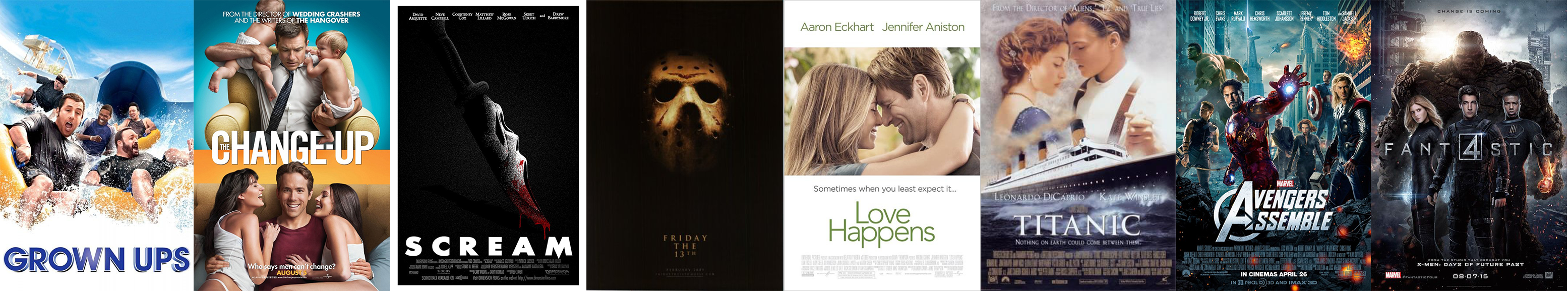
From the left are 2 comedies Grown Ups and Change Up these two movies are mainly male cast and show the life of dads and how they live life with there friends and in the movie it shows how they have fun, So in this the Grown Ups poster it shows the adults on a water slide having a blast of a time, Change up also foreshadows the movie with the title as it is about two best friends who get caught up in a unrealistic situation where they switch lives and they must deal with it for the movie. The 3rd and 4th poster are two very dark posters and has two different items the first being a knife with the Scream mask merged into one and if you have watched the movie you know that the Horror character likes to use knifes to cut up his targets, the 4th poster is Friday, 13th and this movie is iconic for the character to wear the hockey mask and slaughter his victims, The lighting in this poster is crucial and the lighting being slightly more golden than usual really makes the poster look more crisp and generally clean. The 5th and 6th posters I personally have not watched the actual movie and from this my analysis is going to be purely off the poster but the two posters are familiar in the asset that they are both cuddled close to one another but the difference is that the 5th poster the two characters are smiling at one another and this could foreshadow a positive outcome but knowing the outcome of Titanic and seeing this I know that its not a happy ending but also from the poster that the two characters look more tense and serious maybe foreshadowing that they know there fate. The 7th and 8th posters are both Super hero films and from these two posters I said above that they look as though they are about to engage in a battle and from the two posters above I have backed up that statement but also a lot of the time in hero posters it has backgrounds in the city and a lot of the time there are broken buildings, destroyed vehicles, fire and general damage to the surrounded area and this can mainly foreshadow that the final battle could be in the city where they attempt to overtake a big, powerful and dangerous villain.
TECHNICAL RESEARCH UPON MOVIE POSTERS
I've read a lot on the topic of exactly "how do you make a movie poster?" and there really isn't a answer to the question as there are many different graphic designers who have different processes where they like to find text first but I searched up on the internet and I found a very helpful tutorial where it came in this order.
1. Ideas
2. Getting Started and getting into a good rhythm.
3. Finding and implementing the background, This is a hard part as you need to decide what you want to go off such as a background of a skyline, Solid colours, gradient colours, a extreme close up of the Focal point or even general patterns.
4. The Focal point which is "the most important part of the movie poster" as this shows what the movie will have in it. a lot of the time the focal point will be the main character and if its a big named actor then it would most likely drag many more viewers in as some people watch movies for the pure fact that its got one of there favourite actors.
5. The logo, this is a simple area but also difficult as I will have to come up with a clean, simple logo that is looks good and doesn't stand out to the poster. Such as having a metallic looking logo and putting it with an industrial type looking poster so it doesn't stand out as a pink logo would.
6. The Logo Effects this can also make the poster look a lot more modern and recent as adding strokes, gradients and glows to different pieces off the poster can make the character stand out such as the lighting and having the colour of the background slightly more blue so the sky looks more bold.
7. Typography is key as you need to make the text fit with the poster such as if its a modern looking poster then you would want a more modern, bold looking text and a colour that fits perfect with the rest of the poster and if it looks more like a game of thrones sort of poster you would want to go for a medieval type text.
BACKGROUND EXAMPLES
LOGO EXAMPLES
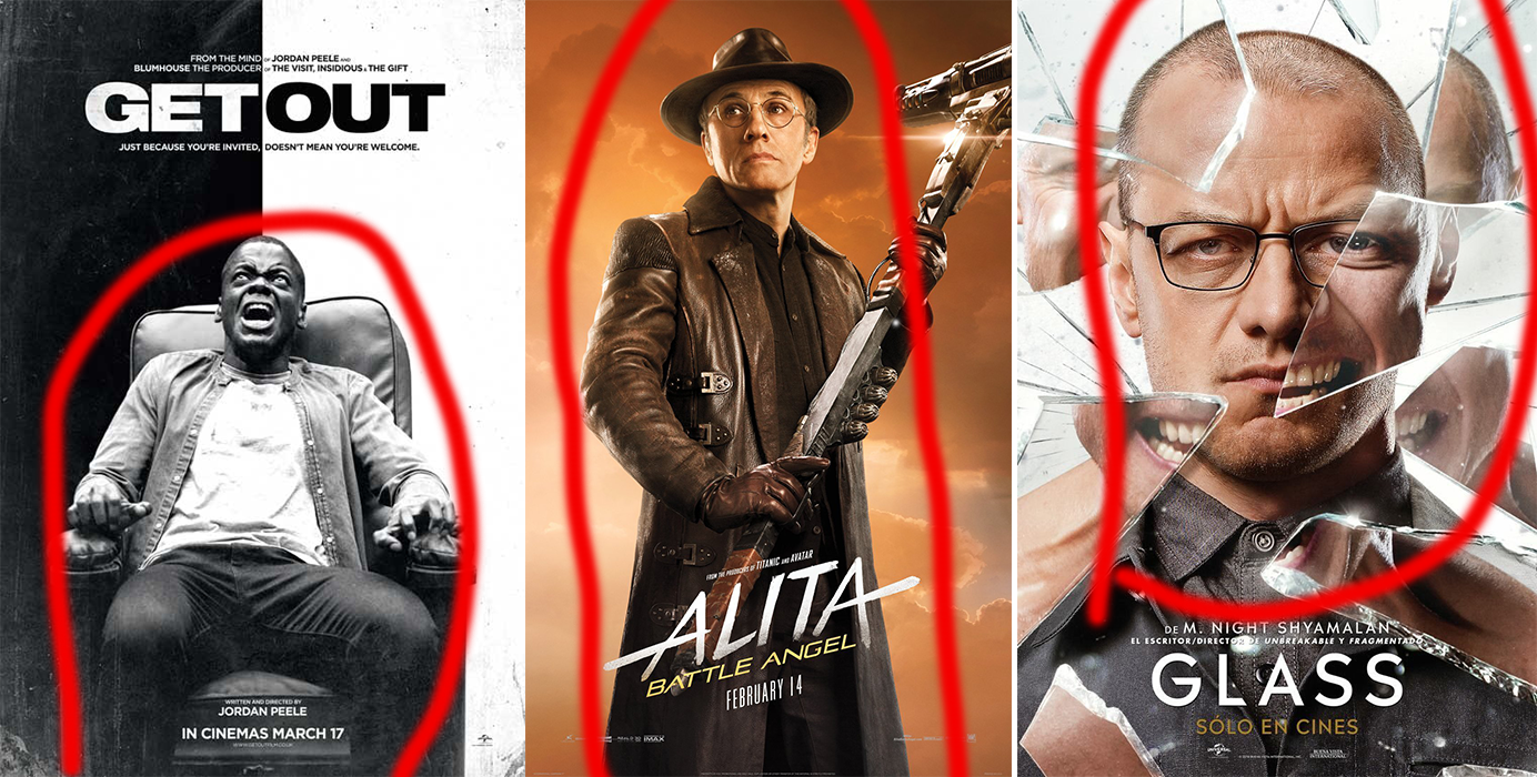
FOCAL POINT EXAMPLES
The Focal point are in the red highlighted circles.
TYPOGRAPHY EXAMPLES
The text on these posters are all iconic as we know IT is a horror movie and it is shaped in a blood flow text, Stranger things being also a science fiction has a bold piece of text which a lot of products have used this text as Stranger things is so big.
|
|
What I am watching is A mini film documented and is played out as a drug film but it links to my graphics as I see there are thumbnails that link to the video and it attracts the viewers as it has an appealing image which foreshadows the end of the film and they do this so viewers are more interested and willing to give the film an actual watch. |
|
TYPOGRAPHY
My posters are all sans serif and as they are bold I feel they pop out more and I am also going for a modern, futuristic theme and I used a white piece of Sans Serif text as it pops out more on the poster and looks much better. The text in general is a lot more bold and I went with the classic white colour as it stands out and is the most readable out of all the colours. |
COLOUR THEORY AND PSYCHOLOGY
|
|
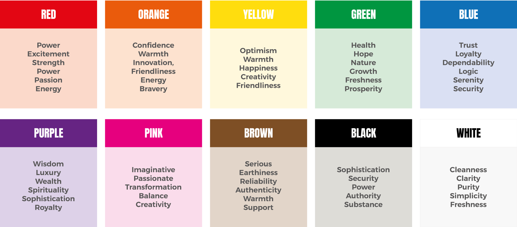
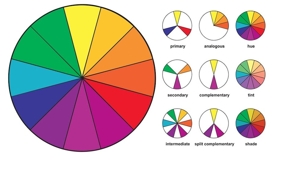
Above is photo psychology and colour theory as the left links colours to what we think of as if I had a lot of red on my poster it would be trying to point out strength, power and passion, whereas with white it shows cleanness, purity and general simplicity. Using this sheet is very helpful as for an action movie it is crucial to have the right colours to link with what your trying to give the viewer.And the right side is a colour theory and it shows the 3 primary colours along with hues, tints, and shades. the wheel shows the colours and what goes well with certain colours.
PLANNING AND PRODUCTION
CHARACTERS
I have several ideas for characters.
MAIN CHARACTER (HERO)
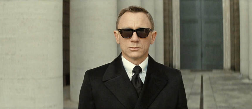
the main idea is a simple character in a suit of any colour, sunglasses. From this i want the older look like men in black with shades. The Suits don't really matter on what colour they are but it would be ideal if it was a black suit as black is very easily mixed with any colour and other colours can be a little harder to find a background for. The sunglasses also don't matter but would also be perfect if they were black as there is a all black theme and then can be a nice colourful background witch makes the black stand out. I would like to think that the design of this character is going off of a James Bond sort of theme with the all black, casual look. Below is the perfect example but I think that black hair would be the perfect candidate as it would be all black and then there would be perfect colour mixture.
MAIN CHARACTER (HERO)
the main idea is a simple character in a suit of any colour, sunglasses. From this i want the older look like men in black with shades. The Suits don't really matter on what colour they are but it would be ideal if it was a black suit as black is very easily mixed with any colour and other colours can be a little harder to find a background for. The sunglasses also don't matter but would also be perfect if they were black as there is a all black theme and then can be a nice colourful background witch makes the black stand out. I would like to think that the design of this character is going off of a James Bond sort of theme with the all black, casual look. Below is the perfect example but I think that black hair would be the perfect candidate as it would be all black and then there would be perfect colour mixture.
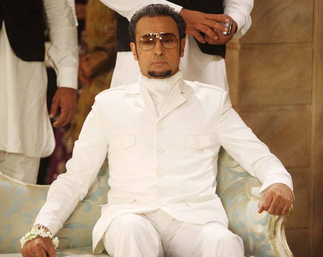
SECONDARY CHARACTER (VILLAIN)
For the villain I wasn't as good at thinking of ideas. None the less it took me a little shorter but came up with a classic rich villain who is rich and wants to take over the world, as they have all of the money in the world and they want to ruin the world as they have so much power. I see this Villain being in a white suit and having a cat but maybe i'm going off of James Bond too much. For the Villain poster I feel as though it would be necessary to have the Villain sat in a chair looking all smug and comfortable holding a button for the explosives. He has a huge grin on his face but slightly more evil than normal. Below is the perfect candidate but with a grin and holding a explosive button which people would then have more sense to know hes a Villain rather than a random main character.
For the villain I wasn't as good at thinking of ideas. None the less it took me a little shorter but came up with a classic rich villain who is rich and wants to take over the world, as they have all of the money in the world and they want to ruin the world as they have so much power. I see this Villain being in a white suit and having a cat but maybe i'm going off of James Bond too much. For the Villain poster I feel as though it would be necessary to have the Villain sat in a chair looking all smug and comfortable holding a button for the explosives. He has a huge grin on his face but slightly more evil than normal. Below is the perfect candidate but with a grin and holding a explosive button which people would then have more sense to know hes a Villain rather than a random main character.
CHARACTER POSTERS
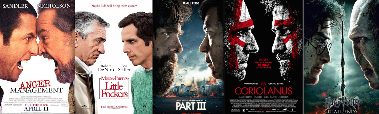
This is a very hard part of making posters it is to show the public what character is which such as these pictures below. From these posters its a classic where both the two main characters face off and from this it feels as though its foreshadowing the movie where these characters are about to fight, have or had a falling out. These are classic posters and are known everywhere as it is two huge actors or characters that everyone knows and loves such as Adam Sandler who is known for his comedy and being a great actor and Jack Nicholson also another huge actor face off in a movie, The Hangover part 3 knowing everyone has watched the two movies before knowing there story line and characters, with Part 3 being a face off of Alan and Lesley Chow who are personally two of the most funniest and weird characters I have seen in a movie and Harry Potter and the deathly hallows which is the final face off of Harry Potter and Voldemort which a lot of fans have looked forward too. These posters relate to my research and work as I would think that these are perfect examples for either two of the posters or just the one with the two mixed up.
This is a very hard part of making posters it is to show the public what character is which such as these pictures below. From these posters its a classic where both the two main characters face off and from this it feels as though its foreshadowing the movie where these characters are about to fight, have or had a falling out. These are classic posters and are known everywhere as it is two huge actors or characters that everyone knows and loves such as Adam Sandler who is known for his comedy and being a great actor and Jack Nicholson also another huge actor face off in a movie, The Hangover part 3 knowing everyone has watched the two movies before knowing there story line and characters, with Part 3 being a face off of Alan and Lesley Chow who are personally two of the most funniest and weird characters I have seen in a movie and Harry Potter and the deathly hallows which is the final face off of Harry Potter and Voldemort which a lot of fans have looked forward too. These posters relate to my research and work as I would think that these are perfect examples for either two of the posters or just the one with the two mixed up.
WHAT I WANT MY TEXT TO LOOK LIKE
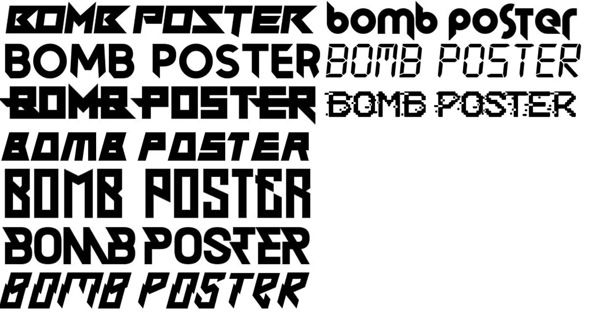
These text pieces below are what I would like to have as a part of my posters. For these I went onto dafont.com and searched through Modern and LCD, I used modern as I feel as though it looks good as it is bulk and stands out and I also thought the LCD screen as a bomb has the timer on it and I thought that it would be pretty self explanatory and simple.
These text pieces below are what I would like to have as a part of my posters. For these I went onto dafont.com and searched through Modern and LCD, I used modern as I feel as though it looks good as it is bulk and stands out and I also thought the LCD screen as a bomb has the timer on it and I thought that it would be pretty self explanatory and simple.
|
|
|
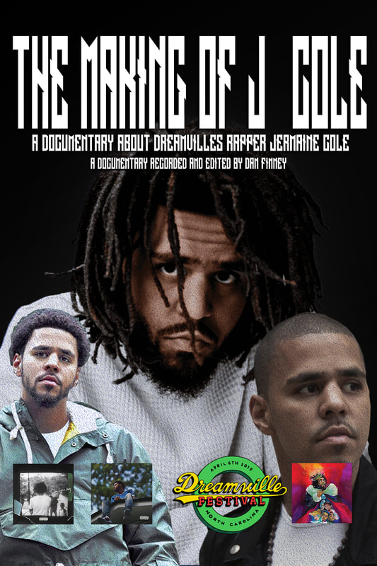
This Image to your left is a Photoshop document I made within half hour at the end of the day. I based it off my favourite rapper J.Cole and these are 3 different pictures of him from the last decade and i find it very interesting that he has such different transformations from different years. In 2008 the 3rd photo was taken and I feel as though this is when he looked the oldest and this is when he came out with his breakout mix tape "the come up", The left photo is the 2014 Jermain Cole and he came out with 2014 forest hills drive, Also my favourite album of all time. The 2 albums on the bottom left side are the albums Cole made in 2014 and 2016 so i felt as though it was crucial to add these to a poster as it shows what Cole has added to the Hip Hop Industry.The middle photo is the Focal point and is J Cole in the middle of 2019 he has longer hair from the other 2 photos so the viewers who are most likely going to know who Cole is as they most likely wouldn't watch if they didn't know him. And i also added the Dreamville logo as that is the industry Cole is with and he made. I also added a gradient with a simple black as the back and lighter in the middle. With The Cole photos it has a different texture and it is also has a white glow coming out of the pictures.
|
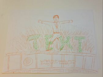
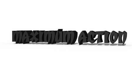
This below is the name of my poster and I feel as though this is a decent name and I feel like not many posters have 3D text and that may be for a reason but I feel as though I could use this for a simple banner with a character. Because it is bold it looks better as it. Maximum Action also foreshadows that the movie is going to have a lot of action and that it is to the max! I feel as though I could add a steel look to the font and it would look a lot better so I will watch a YouTube video on how to make it look steel and keep the 3D aspect to it.

|
To the left is another poster I made and it's inspired by Kobe Bryant and his retirement. I used a poster called amateur to get some inspiration and I thought that having Kobe Bryant as the Focal Point as this is also perfect as more people know who he is because he was one of the best to play on the basketball court. So I feel as though adding a basketball court as the background would look good and a lot of people would understand the concept of it.
|
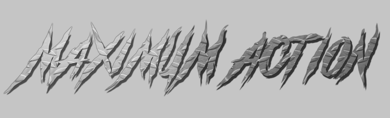
TITLE
My title for my movie is Maximum Action, I got this name off a random generator online. It did take many websites and attempts to find the name that I thought would fit with the poster and design I was going for. I used all capitals on the title and I went with the font of "grind and death" as I thought it would fit well with the text of Maximum Action. And I added a metal steel texture to the text so it gives the feel of modern action movies.
Main Character Poster
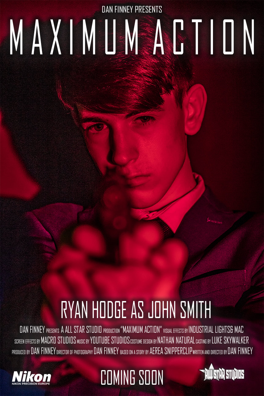
Here is my main character poster. The background is a photo of Ryan my colleague and we took a lot of similar shots in a dark room and I thought it would look good if we added lights and I thought to add colour filters, So I added a blue light that was aimed to Ryan's right side and the red light aimed to his left and from this you can see we angled the camera to be more to his left side so the photo had a lot more red than blue but at the same time you can also see the blue flares pop as in Photoshop I edited it as a raw photo and it gave me a lot more options to play with. That being I get to play with the colours and I popped the red more as i will put a smaller photo of what the photo looked like before. As the colour of the photo is so bright I decided that white text with a white back glow would fit perfect as black or any other colour text wouldn't be so easy to read and generally would not look nearly as good and clear. The shadow also pops out on the left side of the poster and from this I feel this gives the poster more detail instead of attempting to get rid off it, and because there were two different lights there would've been two different shadows but because of how I angled the shot the 2nd shadow wasn't visible. As below you can also see that the red light glows up on Ryan's face and when I took it into Photoshop I was able to clear it up and give much more detail to Ryan (the focal point). With the lighting being so bright I also thought that it was quite a futuristic look like tron and star wars. In the bottom two corners of the are Nikon which is a camera make so it shows that the film has been funded and recorded with Nikon cameras, this is also a little bit of advertisement at the same time. In the bottom right is the All Star Studios logo I made in a separate document, How I made this was I got a star off chrome and downloaded it in a png and put it on a blank document and changed the colour to white, I then put a shadow behind it and made a text layer called ALL STAR STUDIO and added the same effects to that than the star and then put them together and highlighted the two layers and right clicked and as I got all the options I chose Merge Layers and doing so made them one layer and then dragged the layer into the document I had my poster in.

2nd Character Poster

| movie_poster_32_small.png |
This is a small PNG of my 2nd character poster as the weebly site only allows 10MB downloads so this kept me from being able to upload the big file of my PSD file. From this photo I took this at home as I wanted to capture a photo of the photo of myself leaning back as I really thought it looked like a good shot as I got the inspiration from the Hangover scene above of Chow falling back off the Ceaser palace. I also added fake quotes obviously attempting to give the poster a more realistic look as I included big names who review blockbuster movies. I took this shot at home and my 12 year old brother took the photo zoomed in and he took the photo with his iPhone XR and you can tell the quality is off a little bit. But for this I dressed up in a suit and put sunglasses on to look the part and put a single headphone over and around my ear to look as though I could be taking in information. I added the bullets and blood to the back of my head and I realise it may not look as realistic as i would've wished but with the programme and experience I have I think that it was decent. I added at the bottom four made up company names to make the poster also more realistic, The Beats Boys are the music company I made up this was completely made up, All Star Studio because I enjoy basketball and they have all star games so I Incorporated basketball into my movie, I made Industrial light and mac up as well this was random and felt had a nice fit, Macro studios was the final text I made and it was also randomly made. I put "COMING SOON" at the bottom off the poster and this is also self explanatory as it shows the the audience that they can expect to see the movie soon.
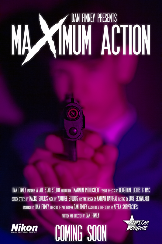
Main Movie Poster

Here is my main movie poster and I feel as though this is the perfect fit for the main movie poster as of all the research I have done there really isn't a big difference from the shots of characters, shots of destinations or general focal points that can occur interest to the poster. But I feel as thought the blend of colour as two primary colours blue and red fit very well and in this poster they bounce of each other and the bold white text stands out very well and is also a good fit as it accessible to read and not a challenge to be able to read from a far away. I blurred the character out as I already have a main character poster and didn't feel as though it would be needed so I had the main character hold a pistol up very close to the lens. This photo was also took into RAW editing and I changed the saturation and this photo was mostly blue but I made it more pink/red as I felt that the white text would stand out a lot better and would be more readable.
MOVIE BANNER 1
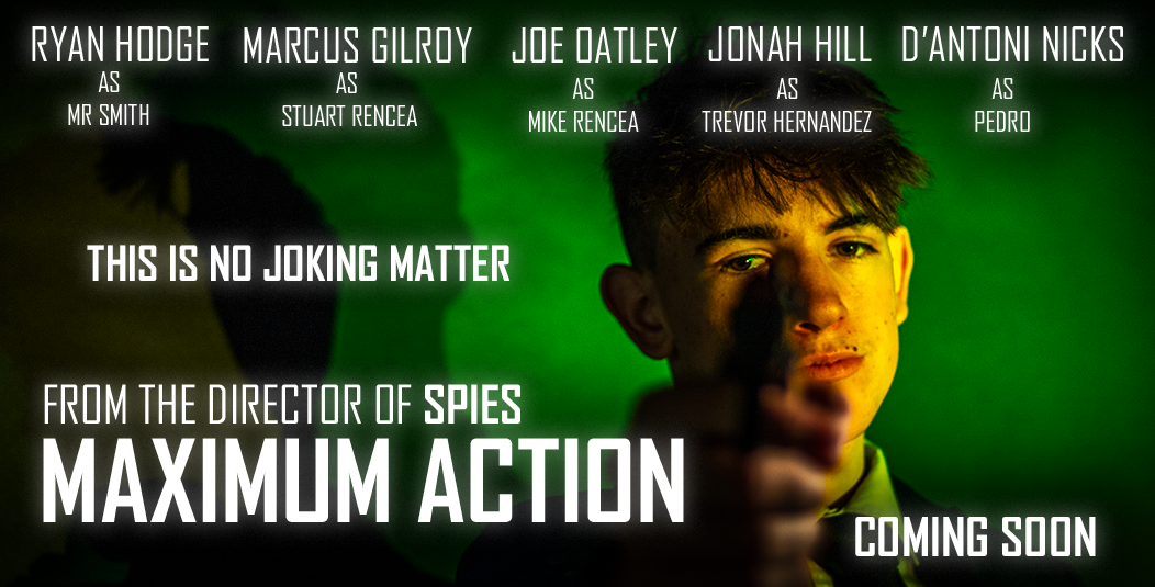
Here is my first movie banner, I made this all in one day. I started off this process by getting my colleague to dress up in his suit and I then take photos of him. With these photos I used three different lights, one normal bright light and two other lights with different filters on them the first with a light green filter and you can see the colour from the green background and on his shirt as he is angling away from the camera where as with his face I used the yellow filter and this was the second light which you can tell was being angled at his face as it is more bright and yellow, I used the camera at a angle shooting towards his face as and what it did was give him a more dirty look and looks alike he has been through a rough past couple of days and then. I saw the face that my colleague was making and I thought it was a great face to make for the focal point as it is a very serious face. I then took the selected photo into Photoshop and searched up on google and found some inspiration. From the inspiration I found I decided to stick and keep to my futuristic look and I edited the raw photos so the colours popped up and stood out a lot more. I then chose a nice Sans Serif, bold and then kept a white colour to the text. I then put several groups of texts such as the general text which of course is "MAXIMUM ACTION" and above I credited myself by having "FROM THE DIRECTOR OF SPIES" which is a movie I made whilst on the course. I also added "COMING SOON" as that is also a must in movie posters and banners, I also added "THIS IS NO JOKING MATTER" and I added this because the focal point had a very serious face. Lastly I added the actors names and who they are playing I took this from a poster and decided to add who they are playing in the movie to also in general boost the poster up and add more text and information on the "Movie".
MOVIE BANNER 2
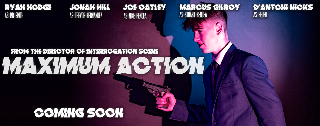
This was also one of the photos I took on the 14th and I also was able to edit and upload this photo all on the same day. This photo was also in the same as the very first banner I made and the same colour but in Photoshop I changed the colour through the RAW photos and then editing RAW settings I changed it to a different colour completely and as you can see those colours are pink and blue. I then cut the side of the image from the left and then made it much more wider so it had more of a fit as an actual banner. This was the trouble as I was trying to search up what size was used for movie banners but there wasn't any actual size as it was a trouble to find an actual size that all graphic companies use. But it also makes it look better as the focal point is my colleague Ryan and he is on the right of the center and that the light is also grading off and from where the light stops i just filled the left side with a black overlay which looks as like it fits in with the photo. I also changed the font to another bold font but it cuts up, This font I downloaded off of the internet and installed it right from the document and it looks really good as a main text. I kept the text with General text and the top of the text saying "FROM THE DIRECTOR OF INTERROGATION SCENE" and this was one of the films I made with my colleagues so I felt as though adding this would make sense. I also added the actors names with the same font as it is a great font for the names to stick out as it is also very bold and also the characters who they are playing but in a different font. I kept the same "COMING SOON" text as this just tells us that the movie is coming soon and that there isn't a release date just yet.
WEBSITE GRAPHIC TAKEOVER
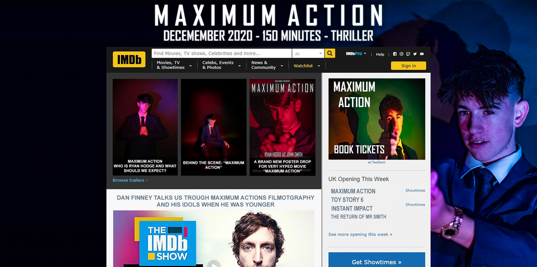
This website graphic takeover really was difficult as I did the most research for this and couldn't find much information but from what I saw it was a picture of one of the characters and at the top it has main information and the big text of the movie, SO I added the date for when the movie is meant to release in "2020 December", I got the IMDb layout and put it in front of the background and added custom texts and pictures as it then looks like a real website.
PRACTICE SKILLS AND PRESENTATION
These are the photos I took of my colleague Ryan in the dark room and in total there are 57 attached photos and I used two of them one for the main character poster and second for the main poster and I took these with the Canon T6 and I also used a 50mm lens to capture a much more clear image. With these photos you can see that there is sometimes more blue and more red in different photos and this is because im changing my stance and where im taking the shot and with a small movement the image can look completely different. I put this under practice skills and presentation as it took lots of shots to get the image i really wanted and pictured in my head and from taking many different photos I practised by changing angles and different stances.
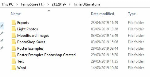
Above is a capture from my folder and I hope this gives you an understanding of my organisation and presentation as I feel that what I do is make a folder that takes maximum 5 seconds and then you can sort your files, documents, exports and general downloads into different folders and then to find the saves it will save a lot of time instead of scrolling through lots of unnecessary files. Below is also an Image of my Photoshop layers and this is also another example of how organised I am as this also saves a lot of time.

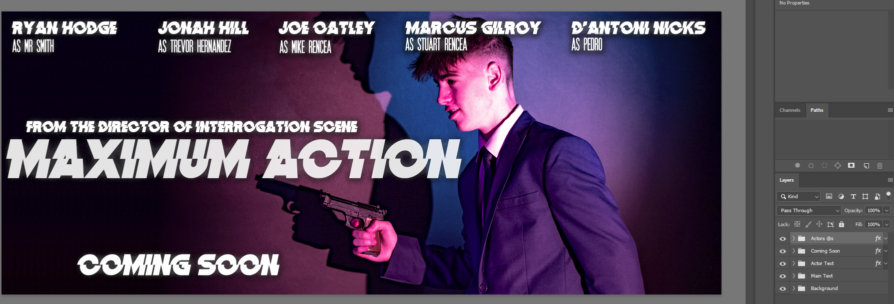
On the right you can see how I have organised my poster. What I have done is place different folders and put the layers in that @ and these are "Actors @s", "coming soon", "Actor Text", "Main Text" and the simple background.
EVALUATION AND REFLECTION
Above is my final evaluation.
Below is the download link for it.
Below is the download link for it.
| evaluation_final.docx |
FINAL POSTERS
PRIMARY CHARACTER POSTER

SECONDARY CHARACTER POSTER

MAIN MOVIE POSTER
MOVIE BANNERS
MOVIE BANNER 1

MOVIE BANNER 2

WEBSITE GRAPHIC TAKEOVER

